

.svg)
.svg)







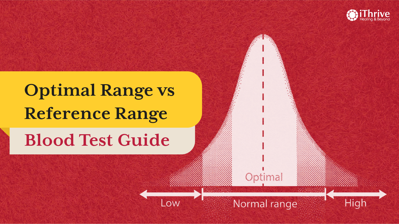
Your blood report says "normal." But if you still feel tired, foggy, or off, the gap between how you feel and what your report says usually comes down to one thing which is optimal range vs reference range blood test results and most doctors never explain the difference.
What is a reference range?
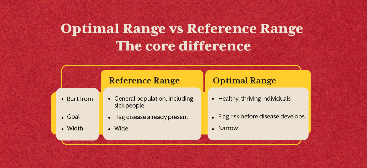
A reference range is the standard "normal" window that is printed next to your result. Labs build it by testing thousands of people, including undiagnosed or mildly sick ones then take the statistical middle 95%. It tells you if you're average but it never conveys that you're healthy.
What is an optimal range?
Optimal meaning, in this context is the narrower band linked to the lowest disease risk and best long-term function in research. It's built from thriving, healthy individuals, and not the general population. Sitting inside your reference range doesn't mean you're inside this optimal window.
Optimal Range vs Reference Range: The core difference
A reference range always asks are you average? An optimal range asks, are you thriving? Like a marker can sit safely inside the reference range for years while quietly drifting towards a dysfunction, simply because the reference range is too wide to even notice.
Reference Range vs Optimal Range: Comparison Chart
Here's what the gap actually looks like on common markers. This is why two people can both be told "normal" while only one of them is actually well.
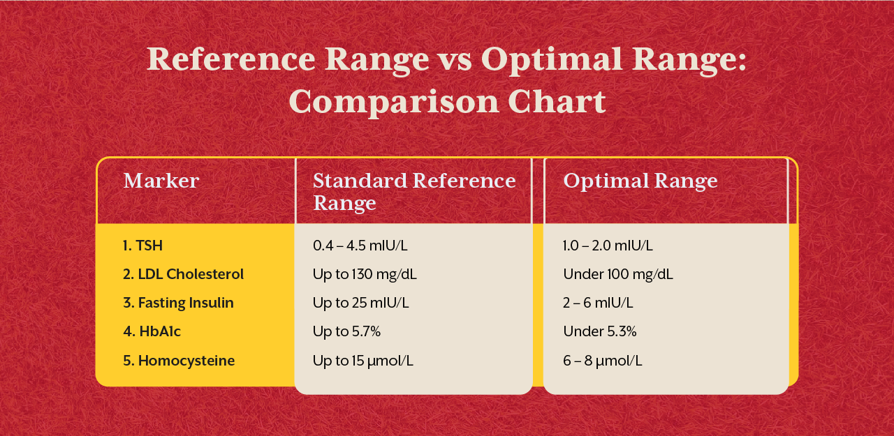
Values are approximate and vary slightly by lab. The pattern stays the same across almost every marker: the reference range is wide enough to hide dysfunction the optimal range is designed to catch.
Are reference range and normal range the same?
Yes. "Normal range" and "reference range" mean the same thing, both of them describe the wide, population-based window printed on your lab report. Neither term implies optimal health, they only show where you stand compared to everyone tested, sick or well.
What does a reference range not detect?
A reference range doesn't detect slow, early dysfunction. It ignores your age, symptoms, and personal history, and it can't distinguish early-stage disease from a lucky test day. Two very different people can both read "normal" on paper.
TSH Normal Range vs Optimal Range
The standard TSH normal range on most lab reports runs roughly 0.4 to 4.5 mIU/L. Optimal ranges used by thyroid specialists sit closer to 1 to 2 mIU/L. Someone at 4.2 is normal on paper but is often already fatigued, foggy, and gaining weight all the way.
LDL cholesterol normal range vs optimal range
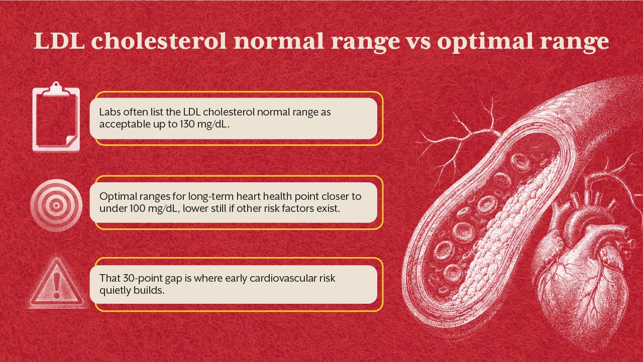
Labs often list the LDL cholesterol normal range as acceptable up to 130 mg/dL. Optimal ranges for long-term heart health point closer to under 100 mg/dL, lower still if other risk factors exist. That 30-point gap is where early cardiovascular risk quietly builds.
Why do "normal" reports miss early disease?
Dysfunction builds slowly, like one small shift at a time. Reference ranges are wide enough to hide that entire process. By the time a marker actually crosses into "abnormal," the underlying issue has usually been developing for years already.
How to actually read your blood work?
Reading one marker at a time against a wide range is why reports keep saying "fine" while you don't feel fine. What matters is reading 60+ markers together, against optimal ranges, alongside your symptoms and history.
This is exactly what iThrive's Root Cause Analysis does. It uses the ranges your doctor doesn't, so it catches what standard testing is built to miss, and connects the dots between markers instead of scoring each one alone.
Normal vs Optimal lab results: What it means for you.
A normal lab result only confirms you're inside the wide reference window, it says nothing about whether your levels support real vitality. An optimal result means your markers sit in the range tied to peak function and the lowest disease risk. Chasing normal keeps you stable but chasing optimal keeps you well.
The Real Cost of Ignoring the Gap
Most chronic disease doesn't appear overnight, it always accumulates for years while every report says normal. Someone with a TSH of 4.0, LDL of 125, and fasting insulin of 20 can walk out of 3 straight check-ups with a clean report. None of those numbers cross a line on their own.
But together, they paint a different picture, like one drifting toward hypothyroidism, insulin resistance, or heart disease, quietly, one report at a time. This is the real cost of relying only on reference ranges.
The years when a small shift in diet, sleep, or supplementation could have reversed the trend get spent believing nothing is wrong. By the time a marker finally tips into "abnormal," the fix usually takes longer and costs more than it would have earlier.
Optimal ranges close this gap. They flag the drift while it's still reversible, not after it becomes a diagnosis. That's the real value of testing against a narrower, evidence-based window instead of a wide population average.
This is exactly where a structured Root Cause Analysis matters most. Instead of waiting for one marker to cross a line, it tracks how your markers move together over time, against optimal ranges so the drift gets caught while it's still a pattern, and not a disease.
Key Takeaways
Reference range and normal range are the same thing, a wide, population-based window, not a marker of true health. Optimal range is narrower and tied to the lowest disease risk, not just statistical averages. Common markers like TSH, LDL, and homocysteine often read "normal" while sitting well outside the optimal window. Reference ranges can't detect slow dysfunction, symptoms, or personal trends. A Root Cause Analysis reads markers together against optimal ranges, catching drift a standard report misses entirely.





.jpeg)









.svg)